Quilt Colors and Depth with Visual Temperatures
Heather ThomasHeather Thomas discusses warm and cool quilt colors. Each color in your quilt creates depth due to its visual temperature. Watch this quilting tutorial and learn more about colors and depth for your next quilting projects.
It's important, as far as I'm concerned, to learn more about color if we're gonna continue to make art quilts, quilts, any type of craft that we do. It just helps us to make better work. And I don't know about you, but if I'm gonna spend my time and energy and, let's face it, my money, making beautiful things, I want to know that they're gonna be beautiful each time I make them. Now I know that not everything's gonna be fabulous. But I know that there's a greater chance of it being fabulous if I have harnessed the colors that I'm using.
If I know their personalities. If I understand how they are going to interact with each other. And it's that interaction that's really important. Knowing red is fine. But until you understand how red plays off of green or red plays off of blue, you don't really know red.
So the more practice we have with learning about color, the better artisans we're going to become. And it doesn't matter whether you make traditional quilts or art quilts. Color is color. And I think most of us wanna make things that are more attractive. One of the things that most people don't understand is that the colors have an actual visual temperature.
And that temperature is important for a couple of reasons. If they're a warm color or a cool color, it actually affects us physically. Warm colors make our temperatures go up. Cool colors make our temperatures go down. Warm colors evoke feelings of warmth, but also of spiciness, of exoticness.
And cool colors make us think of water and oceans and trees and forests. So they evoke memory in us. But probably the most important thing to understand about visual temperature, whether a color is cool or warm, is how that color occupies space. If a color is warm, it's going to come forward or advance. If a color is cool, it's going to recede.
It's gonna sit in the background. And these two play off of each other well, warm colors and cool colors. The problem is is that most of us don't realize that there are also some temperature neutral colors and that we were pretty much lied to and continue to be lied to according to some colorists. Now I follow the colorists Joseph Albers and Johannes Itten. They were big colorists from the 30s and 40s and did lots of educating and lots of writing about color.
And they both believed that there were four colors on the color wheel that are temperature neutral. And the reason they consider them temperature neutral is not because they don't evoke feelings of warmth or cool, but because they neither recede nor advance. They sit on the mid-plane. Those colors are red, red-violet, green, and yellow-green. Now most of us were taught that the reds were warm and the greens were cool.
And when it comes to the way they make us feel, they probably are. We think red hot. However, they don't advance or recede like the rest of their warm or cool colors. The true warm colors are yellow, yellow-orange, orange, and red-orange. So this range right here.
And the true cool colors are blue-green, blue, blue-violet, and violet. This is important. These colors will recede. Whereas these colors will advance. And the reds and the greens will sit on the midplane between the two.
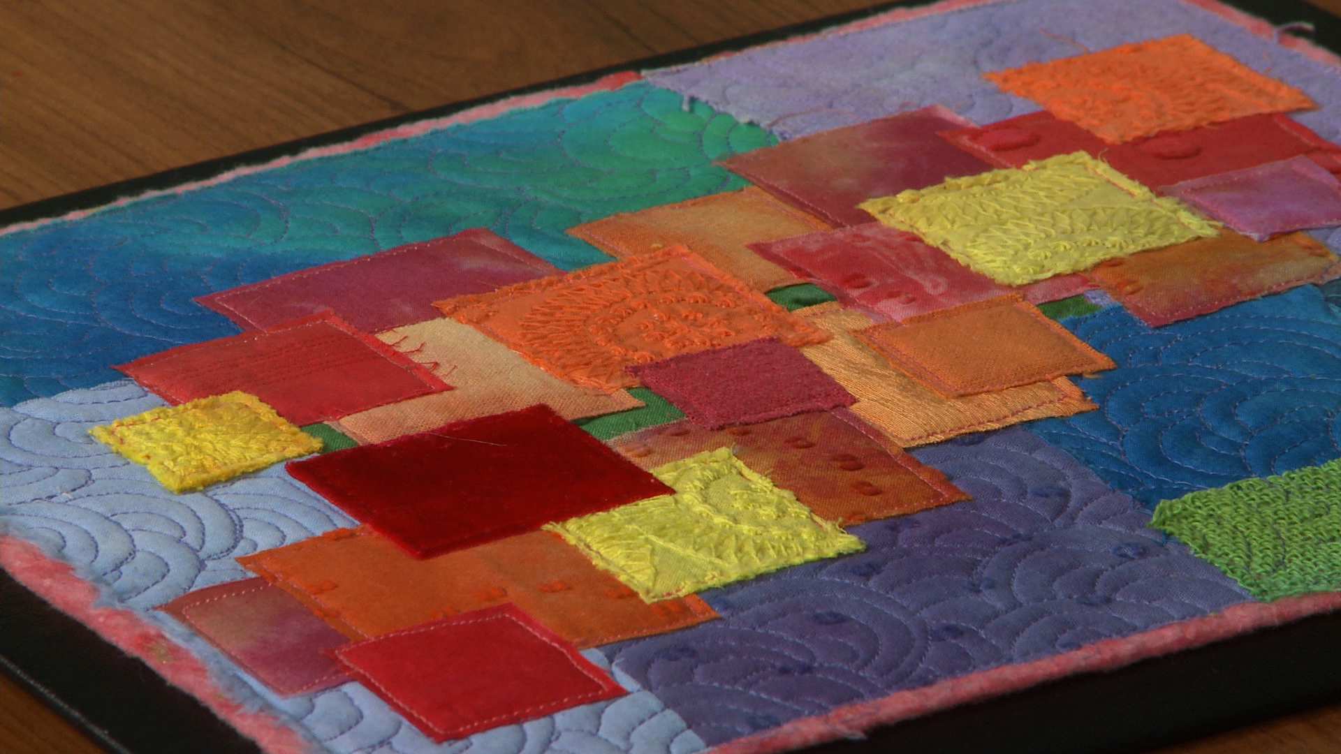
We can see this when we play with the two groupings together. Here, we have a small piece that I did exactly what I needed it to do so that it would behave the way it should behave. I've put the cool colors in the backdrop. They're behind the warm colors and the warm colors are coming forward. The warmer the color and the bigger the piece, the more it comes forward.
So these yellows and oranges come forward more so than the things that are pink. This piece has a mixture of cool colors in the backdrop and a mixture of warm colors coming forward. The only red, true red, that I included was a piece of velvet and it's on top of everything else. There's nothing sitting on top of it. So you can't fight physics.
It physically is on top. So it makes us feel like it's coming forward. However, if we had it underneath, it would be buried underneath and it probably would be going back with the cool colors. And the cool colors are all doing exactly what they're supposed to do. They're sitting and resting behind all the warm colors.
For my eye, the one that's the farthest back is also the one that's the darkest. A darker value is always gonna go back farther than a lighter value. But what's really interesting is to look how they work together. In this piece, which I called Doorways, we've got doorways that are cool and doorways that are warm. And I actually messed with the physicality of it too.
If it was cool, I did reverse applique. So I put a piece behind and then another piece behind and another piece behind, rather than a piece on top and another piece on top. So here I did cutaway work and here I layered on top. So the physicality is helping also. Because I know how a color behaves, I can aid it.
I wanted my warm colors to come forward and I wanted my cool colors to recede. I also put darker, duller colors in the center of the cool doorways and went with lighter colors in the center of the warm doorways. So for these, the doorway comes forward. Whereas for these, the doorway recedes into. And I really love the way that plays off of the surface.
So next time you're choosing your fabrics or your colors for your quilt, remember that you can affect the viewer and affect the pictorial that you're making, the picture that you're making, the quilt that you're making by using colors according to how they want to behave. That warm colors wanna come forward or advance and cool colors wanna recede. And this will help you create depth.


That was really interesting. I now want to experiment doing the warm out front and the swap and do cool out front to see the difference. I imagine the cool out front would look flatter and less dimensional?
I am a newbie on quilting. I love video's that talk about the color wheel. my dilemma is what about the color of your painted walls. my walls are a white /gray (alabaster) what color would gray be in ??. I was told to use warm colors in my quilts .
Yes, agreed you never disappoint. Your teaching is always thoroughly researched and thought through. Your recent tips on quilting using Iris pins was fab too - quite amazing. I'm now going to work through the colour workshops in your book as my 2015 learning project. One a month. Sorted. Thanks for your work and generous sharing.
I did not know any of this. always thought red was a hot color...hmmmm will have to think about all this for my next fabrix choices. thank you....
I took art lessons for a few years just because I couldn't make sense of anything when I walked in to a quilt shop. Color is everything, learning to know what it can do, is priceless. Please keep teaching on color. It is always about the basic. When I go to this site, I am hoping and looking for real knowledge and you do not disappoint. Betty