How to Use Contrasting Thread Colors in Your Quilt
Heather ThomasContrasting colors can help add additional design elements to a quilt. Heather Thomas shows you how to add contrasting thread to a quilt in ways that complement the overall design.
Quilting Colors
When it comes to quilting, more often than not, the thread color used will match the main background color of a quilt. This is done because quilting is intended to hold the layers of fabric together and help showcase the quilt design. However, Heather shows you that contrasting thread colors can be used to tie a piece together. She shows you several examples and explains how contrasting thread can be used to balance a quilt if the color of thread being used matches a color of fabric used somewhere in the design. She also shows how multiple different colors of contrasting thread can be used in the same design to help a certain section of a quilt stand out. Contrasting colors can be added with thread as well as with fabric. Heather shares great tips on how to choose quilt colors when planning a design.
Quilting Shapes
An element of design to keep in mind when using contrasting thread is the shapes being quilted. Heather explains how quilting a shape that isn’t included anywhere in a quilt in a contrasting color may make a piece look unbalanced. However, quilting a shape that is found somewhere in the quilt in a contrasting color can help unify a piece, as Heather shows with an example quilt.
Multiple Colors
As Heather explains, multiple different thread colors can be used when quilting, especially when the main fabric colors of a quilt are neutral. A fun way to add many different colors to a piece without having the continually change thread is with variegated thread quilting. Variegated threads come in a variety of color combinations. When using variegated thread it’s important to test stitch with it first as the thread will look different stitched on a quilt than it does on the thread spool.
As an avid machine quilter and someone who teaches machine quilting, one of the things that I'm constantly concerned about is how the stitch line affects the quilt. And generally speaking, I advocate using colors that match the surface area that you're stitching on for lots of reasons, but mainly, because the quilt often doesn't need more contrasts and you don't want to have quilting on a work that competes with the piecing or competes with the other design elements. The quilting is generally there to hold the layers together and to enhance what's already happening. Generally, not always. But sometimes we end up with a piece that needs a little bit more of a pop, it needs some interest.
And we can't find another answer by adding more fabric or another design element. But we think maybe perhaps, if we quilt with some contrast we can perk the piece up. To make this work we have to pay attention to a few good ideas here. We need to make sure that whatever quilting we're adding is repeating something that's already present, not bringing something entirely new in. If we're gonna use a color to quilt with, a different color to quilt with.
The reason this is, is if I were to add a bunch of stars to a quilt that's nothing but circles in colors rather than in the color that is matching the fabric, but in a contrasting color, then I'm adding a whole new design element that may not really look good because it doesn't unify the piece. So instead if we're going to add the contrast of color to a quilted area we should repeat something that's already there. So here are some samples that are actually doing that very thing. So when I was finished with this piece I felt that there was a disparity between this area and the squares, and I wanted to create a visual link. To do that instead of quilting this background with blue, which I could have done because there are blue lines here.
I decided to do it with green, which was the background of this piece. That would pull that background across the surface and make the eye of the viewer move back and forth more smoothly. And I think it was very effective. Whereas in this piece, when I got finished, I had these three distinct areas here, here, and here. And the first thing I did after I quilted everything, is I knew I was gonna be putting this on.
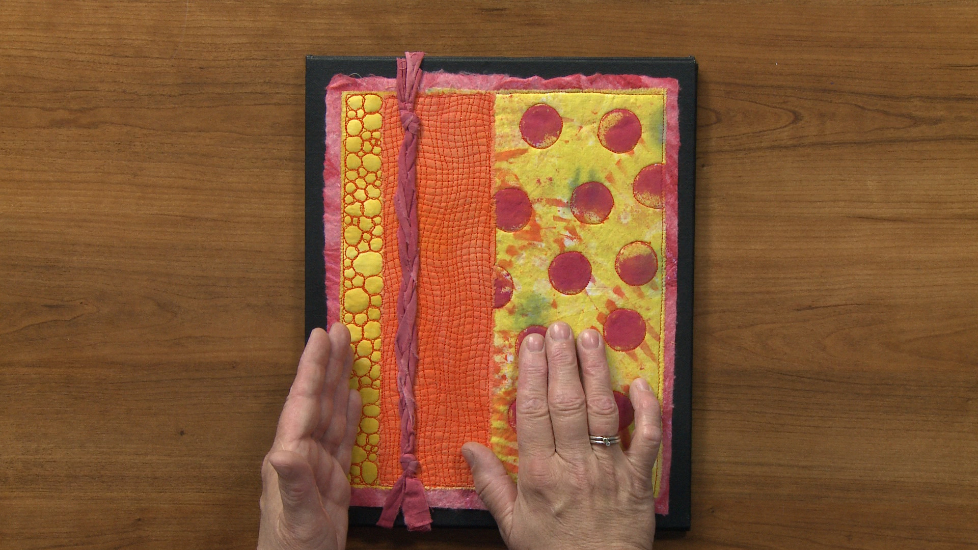
So after I quilted this section, I put this on, so I could see how it was affecting the other sections. I went ahead and quilted this, which was simply quilting around the circles to highlight them a bit. And then I had this area, I knew I wanted to repeat this circular idea, but it felt that it wasn't really cohesive. And so I decided to bring this orange color, this orange color over here, so that all three sections shared the color orange and quilted with orange circles. And I'm really happy that I did.
I think it's very, very effective. Now this piece is chaotic. And what's really interesting is that sometimes if a piece is chaotic, if you add a little bit more chaos, it basically makes the piece congeal and it looks better. This piece, I actually took quilting out of, which I never do, but these pieces were important to me. They're part of a series that I was working on and I needed it to be a good piece of work.
So I had quilted these squares, and I'd quilted these lines, and I'd come in and started quilting a section of the background in black. And when I did that the piece just kind of continued to be somewhat flat. So I pulled the quilting out and thought, "Okay, well maybe I should put some pink in there." And I laid the pink thread down and it looked, I don't know, bubble gummy, little girly, or something. It was just too much pink. And I thought the pink would be repeating the pink lines that were already there and it might work.
So then I grabbed a turquoise or a blue-green thread and dribbled it on the surface and it just perked everything up. So I went ahead and quilted the background, rather heavily, with straight lines that are moving at all different angles in that blue-green. And what it did was it pushed these pieces off the surface and showed them to the viewer. And it looks really cool, I really like it. Finally, this piece.
And it hangs this way. I knew that I wanted to add color to the work. This was all white, black with black and white. And I knew I was going to add these bone beads that had been dyed these fun little colors. I thought those colors would be enough.
So I had quilted in here and I, again, put these these little circles down to see what it looked like and it was just boring. So then I thought, "Hmm, what to do, what to do?" And thought, "Okay, well I'm just gonna grab thread colors "that are the colors of the beads." And I dribbled them on here and thought, "Oh, it just looks absolutely fabulous!" My first thought since I had been dribbling was stipple because a dribble of thread looks like a stipple but I'm so glad I didn't do that, that I moved to a linear path instead. So I've got this kind of wonderful movement that's constantly moving your eye across the surface. And this is just floating on top. If I had stippled I don't believe we'd have the movement that we have.
So I ended up very, very happy with this piece. So remember if you're going to use a contrast in color of thread when you quilt, that it needs to repeat something that's already happening in the quilt so that it unifies it, and doesn't add another contrasting element. Quilt carefully, but consider quilting in different colors.


Can anyone show or tell me how to make quilt out of OLD BLANKETS?
Does anyone know how to make a quilt from OLD BLANKETS? If so can i please see a design or an example of one that is completed?