 Choosing the right color combination for your quilt can be a difficult decision. Different colors communicate different feelings and emotions, which will influence the overall feeling of a completed quilt. When picking out fabrics, think about the color symbolism to help shape your quilt personality! Here are some interesting color profiles to get you started:
Seeing RED
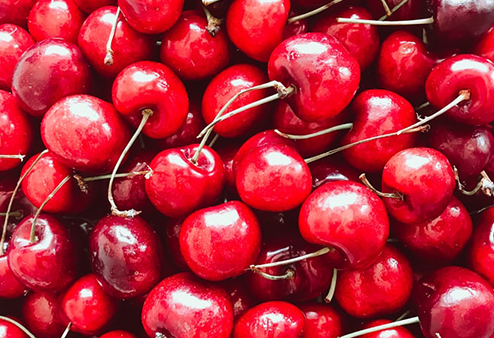
Red is an intense and passionate color with a high energy. It symbolizes the opposing emotions of love and anger. On its best side, red is a warm, potentially cozy color. Fall leaves, rubies, cherries, and even Santa Claus’ coat are all examples of red representing warmth. However, red can quickly get “too hot,” and begin to represent other things. Red invokes images of urgency, which is why traffic signs like “do not enter,” “wrong way,” “yield,” and “stop” are painted in this color.
ORANGE you glad…
Orange is the color of optimism! Warm, exciting, and bold, orange is a color that inspires creativity. It has all the energy of red, without the aggression. For this reason, orange is seen as more joyful and happy. Additionally, orange is thought to stimulate the appetite. Burger King, McDonalds, Pizza Hut, Little Caesars, and Dairy Queen are just a few of the fast food chains that have incorporated orange into their logos. It theorized that orange may also encourage impulsiveness and frivolous spending.
Follow the YELLOW brick road
Much like orange, yellow is seen as a happy color. Yellow is often associated with cheer and enthusiasm. However, its high energy can become overstimulating at times. When used in moderation, yellow signifies intellect, stimulating our clarity of thought. Unlike the other warm colors, yellow does not provoke emotion like orange and red do. This is why it is thought to give off an analytical feeling, as it speaks to the head and not the heart.
GREEN with envy
Though it is commonly associated with jealousy, green is a very peaceful color. Green is the color of the Earth, symbolizing the abundant foliage found throughout the environment. Since it is such a naturally occurring color, green instills the feeling of life and growth. Green is all around us, so it makes us feel at ease! It is also a very well-balanced color, feeling both fresh and relaxing.
Feeling BLUE?
Blue is a sincere and peaceful color. Much like green, it is seen as very relaxing and tranquil. However, blue is a bit more muted, and it is much quieter. Blue is calm. It is thought to reduce stress and give us a sense of stability. Much like green, blue is an abundant natural color. When we think of blue, we may think of the ocean or the sky. Both give a feeling of openness and possibility. On the contrary, blue can become a little melancholic. Some say blue feels cold, sad, and distant when used in excess.
PURPLE power
The color purple is thought to be associated with individuality. This may come from the history of the color, which was only worn by royalty. Purple was a difficult dye to produce and purchase, making it rare. Though it is widely accessible these days, purple still has a magical and luxurious feeling. Unlike blue and green, it is not found often in nature, which is why we may find it a mysterious color.Quilt Colors and Depth with Visual Temperatures
How to Choose Fabric for a Quilt Using Accent Color Fabric
Quilt Color Ideas: Adding ‘Pop’ to Your Quilt
Choosing Quilt Colors: Tips and Techniques
How to Use Contrasting Thread Colors in Your Quilt
Quilt Designs with Multiple Colors
Working with a Tetrad Color Wheel
Working with Monochromatic Colors Schemes
Defining Color Personalities with Grayscale and Quilting Color Wheel
Using Direct Complimentary Colors in Quilt Designs
Related Articles:
Quilting Color Principles: Contrast and Blending
Quilting Color Principles: Tint, Tone, and Shade
Quilting Color Principles: Common Color Schemes
Quilting Color Principles: Analogous Color Schemes
Quilting Color Principles: Complementary Color Schemes
Have something to add? Leave a comment or email editor@nationalquilterscircle.com.

Looking forward to learning about complimentary colors.
I’m curious about pastels… what emotive vibes do colors like pink or lavender evoke?
No comment
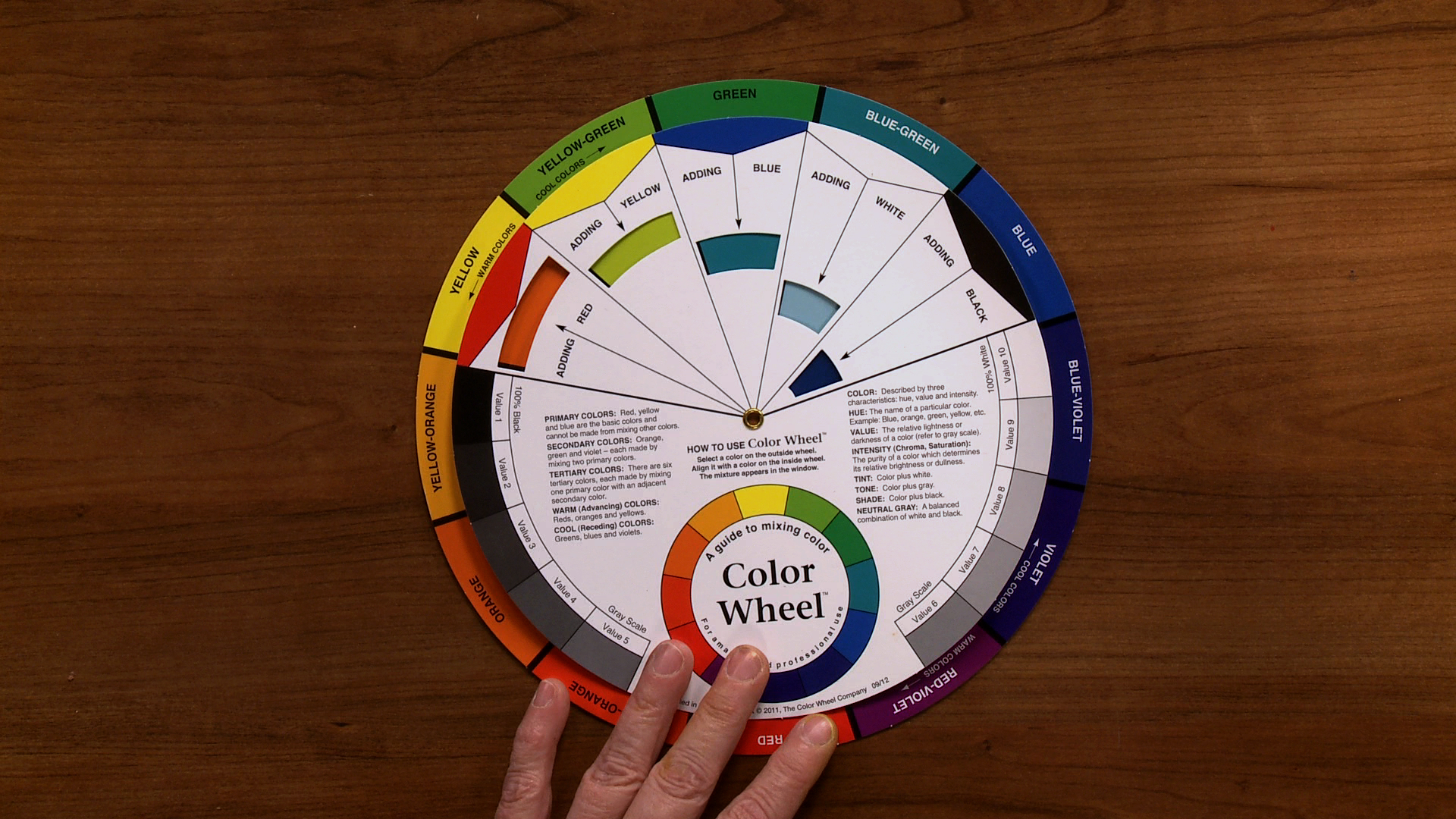
Enjoyed your article. Like the color wheel Very useful.
Thank you Heather Thomas for your extremely interesting and informative video on how to use a colour wheel - this is an exceptional video.
mine is purple
My favorite color is Purple. I use it a lot for Halloween quilts as it is the color of mystery and power.
My favorite color is green and rosy pink, but my favorite quilts are scrappy brights.
want to learn more.
My favorite color is blue. I use it most often in quilts. I love just about every blue hue, tone, and shade. I also like red in quilts, especially when combined with white or blue.